|
february 1, 2010
|
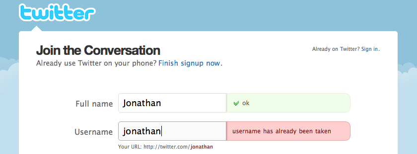
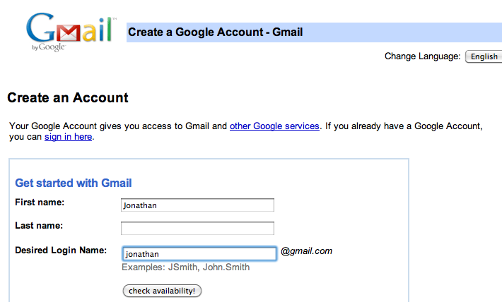
4 Tips for Improving Web App UsabilityHere are 4 tips for improving the usability of web applications. I'm drawing a distinction here between web site and web application. A web application is a tool that helps accomplish some purpose while a typical web site has static content that presents information. These tips are presented in the context of improving a simple web app designed to perform timezone conversion. I recently created thetimezoneconverter.com after finding the top existing apps made for this purpose suffering from serious usability flaws. 1. Provide instant feedback Giving users fast feedback on the result of their actions has many benefits. It encourages trial and error or iteration toward a desired result. It allows "what if" scenarios and exploration through a larger input-space. And it helps a user produce better output since the feedback cycle is small and can be executed more times. The most typical example of this in sign-up forms around the web is forms that instantly tell you whether a username is available. Twitter does an excellent job at this providing feedback as you type. Google's experience is slightly worse forcing you to click a button to check availability:
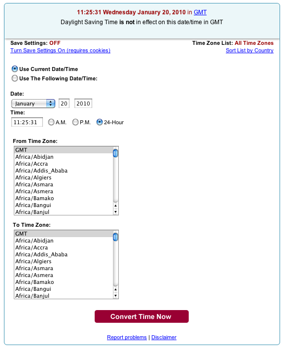
The existing first and second Google search results for "time zone converter" provide glacially slow feedback for users entering a time. Users must select times from pop-up menus and choose cities from a list sorted by continent. Then, the user clicks a submit button waiting for the contents of the form they just completed to be sent to a server. Only upon page refresh are results of the input presented.
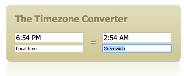
I improved upon this interface with the fastest feedback possible: providing the timezone conversion after each keystroke. There's no need for a page refresh, navigating pop-up menus, or even hitting enter.
2. Don't skip user testing, log analysis, or simple feedback from friends Simple user testing is crucial to getting usability right. There's simply no way to perfectly predict how users are going to think about or use a product. Steve Krug's Don't Make Me Think spends three chapters on how to do quick usability tests.
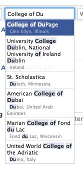
When designing The Timezone Converter, I guessed that users would want to specify timezones by major city. I found out after soliciting feedback from users over Twitter and through web logs that users actually wanted to look up timezones via several other keywords as well. In addition to cities, I ended up adding timezone names (like "Pacific Standard Time" both full names and abbreviations), GMT offset names (like "GMT+7"), country names when the country resided completely in one timezone, and US states after international users mentioned they often didn't know a major city in the state they were calling. I had no idea before testing that users would want to specify times in all these different formats. 3. Use intelligent parsing and autocomplete when possible Autocomplete text fields combine an earlier tip (instant feedback) with text entry. If you ever find yourself creating a pop-up menu with more than 10 options it's likely an autocomplete text field would be a better replacement. Big pop-ups overwhelm screen real estate and obscure controls behind them. They also can be slow to appear. Facebook uses autocomplete boxes effectively when searching for friends or schools.
Numerous Javascript libraries now make autocomplete fairly painless. On this site I used Devbridge Ajax AutoComplete and tweaked the code so that it always had an option selected. 4. Fit UI to the user, not user to the UI It's important to design with users in mind, rather than programmers. Often there's a tradeoff between making something that is easy for the user to interact with versus making something that is simple to engineer. Other times, though, with a bit of thought or research you can find a way to design a web app such that it's easier to use and program. An example of such a case came up on The Timezone Converter. Although at first it appeared that parsing a time might be easier done with pop-up menus as is done with Time and Date.com's converter (see screenshot above) than parsing a free form text field, it turns out there is an excellent Javascript library written specifically for this purpose. It's called Datejs and even handles locales from around the world. Conclusion You should take special care when designing a web app to think from the user's perspective about usability. Javascript tools today make designing usable interfaces easier than ever. |
||||||||||

